
III: CREATE THE MAIN COLLECTION
The main.collection within this template contains the following components: (a) a background, (b) a Graphic User Interface (GUI), and (c) a level1_proxy and level2_proxy.
Add a main.collection
Double-click the ‘main.collection’ within the ‘main’ folder of the Project Explorer….and then add two new Game Objects to the collection, (a) ‘background’ and (b) ‘controller’. Within the Properties Window, center both the ‘background’ and ‘controller’ Game Objects on the screen by setting their Position x: 1112 | y: 834
Add a Sprite to the Background Game Object
Within the ‘background’ GameObject — add a sprite component to it. Within the sprite’s properties, reference the background.atlas as the Image, and ‘background_2224x1668.png’ as the default animation.
Please note that in order to comply with Atlas size constraints, I had reduced the size of this background .png image — so, we’ll need to change the scale of the background game object to have Defold resize it back to it’s original dimensions. A scale factor of 1.25 for both x and y will do that.
If you haven’t already — I’d recommend doing a ‘SaveAll’ at this point, just to ensure you don’t lose anything.
IV: BUILD THE GRAPHIC USER INTERFACE (GUI)
Overall Approach for GUI Sets
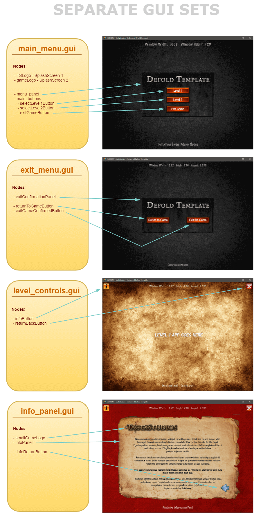
For this template, I’ll be building four distinct GUI sets as depicted in the following graphic. I’m experimenting a little bit by segmenting the GUI Nodes across multiple sets — to facilitate better control over which nodes have input focus at any given time when running the game. The GUI Sets I’ve chosen support: (a) the Main Menu, which will appear immediately following the completion of the Splash Screens, (b) the Exit Menu, which is used to obtain confirmation from the user that (s)he really wants to exit the game or a chance to return back to the game, (c) Level Controls, which will appear when the user is playing one of the levels – essentially the means for exiting the level, or for obtaining help information, and (d) Information Panel Controls – enabling a help screen as well as a button to allow the user to return to the game.
The following diagram summarizes each of the GUI Sets, as well as highlighting the location of each of the GUI Nodes.
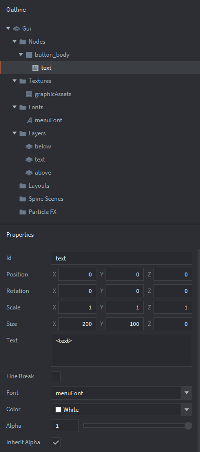
Adding a Button GUI Template - button_template.gui
For this project, we’ll be using a template for a generic button which will simplify the creation of the numerous buttons both in this template as well as future games. The button template is created as a new GUI within the ‘main’ folder of the Project Explorer — and named ‘button_template.gui’.
With ‘button_template.gui’ in focus within the Outline Window:
The final composition of the ‘button_template’ should be similar to the following:
Build the Menu GUI - main_menu.gui
The first GUI file to be created is main_menu.gui. This controls the splashscreens and the level selection buttons, as well as the Exit Game Button. To build it – create a new gui file within the ‘main’ folder of the Project Explorer, change the name to ‘main_menu’ and put it into focus within the Outline Window.
Add Key GUI Components to main_menu.gui – Box Nodes
With the main.collection in focus within the Outline Window — within the main_menu.gui — add the following GUI Nodes:
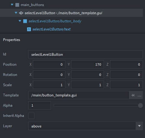
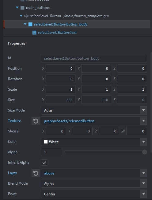
Add Key GUI Components to main_menu.gui – Button Template Based
We’re going to segregate all the menu buttons together under a Game Object (main_buttons) within the main_menu.gui. Add a GameObject (main_buttons) to the main_menu.gui within the Outline Window. The following illustrations highlight how to add a Button to the ‘main_buttons’ GameObject using the button_template.gui that we created in the previous section.
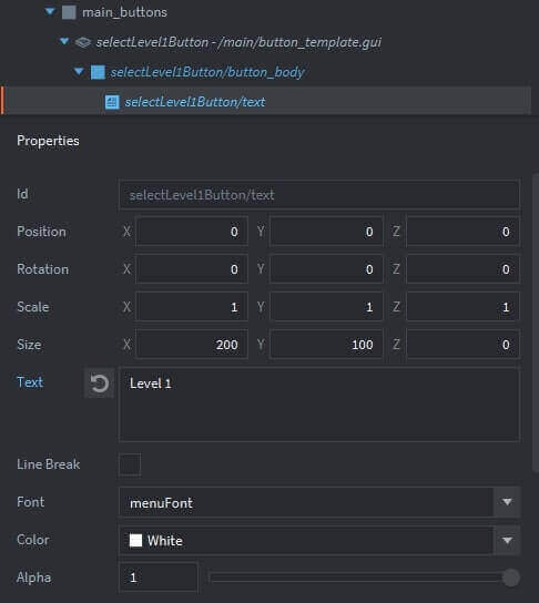
The other GUI nodes in this main_menu.gui set are built in a very similar fashion.
Now we’re ready to build the exit_menu.gui, level_controls.gui and info_panel.gui — as described below:
Build the Game Exit GUI: exit_menu.gui
The next GUI file to be created is exit_menu.gui. We’ve already set up a button which would enable a user to indicate that they want to exit the game — but to conform with standard practices, we should also have a confirmation popup to allow a user to either exit the game, or to return to the game. To build it – create a new gui file within the ‘main’ folder of the Project Explorer, change the name to ‘exit_menu’ and put it into focus within the Outline Window.
There will be three GUI Nodes in this set – the following procedure is used to create them:
Build the Game Exit GUI: level_controls.gui
This GUI file is level_controls.gui. These nodes apply when the user is active in one of the game levels. They enable the user to exit the level and return to the main menu –as well as the ability for the user to call up a help popup — which could include information such as game instructions. To build it – create a new gui file within the ‘main’ folder of the Project Explorer, change the name to ‘level_controls’ and put it into focus within the Outline Window.
There will be two GUI Nodes in this set – the following procedure is used to create them:
Build the Information Popup Node: info_panel.gui
An important element of this Defold Game Template is the ability for the user to call up a help popup — which could include information such as game instructions. To build it – create a new gui file within the ‘main’ folder of the Project Explorer, change the name to ‘info_panel’ and put it into focus within the Outline Window.
There will be four GUI Nodes in this set – the following procedure is used to create them:
Add the GUI sets to the ‘main.collection’
Within the Project Explorer, bring ‘main.collection’ into focus.
V: CREATE TWO COLLECTION PROXIES
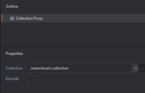
The collection proxy component is used to load and unload new game worlds dynamically based on the content of a collection file. Within the Project Explorer — right-click the ‘main’ folder | select ‘New’ | select ‘Collection Proxy’ | name it ‘level1_proxy’. Change its properties to reflect the following:
Then we need to add it to the main.collection. Place ‘main.collection’ into focus, and then within the Outline Window. Add a new Game Object – change the id to ‘proxies’. Right-click the ‘proxies’ Game Object | click ‘Select Component File’ and | select ‘level1_proxy’.
Similarly add a ‘level2_proxy’, reflecting a pointer to the level_2.collection within its properties to the ‘proxies’ game object.
V: ADDING SCRIPT FILES
This new Enhanced Defold Game Template includes three categories of Lua code: (a) a Lua Module, essentially containing general purpose functions that can be reused, (b) GUI Scripts which support each of the GUI sets created above, and (c) Level Scripts which will contain logic specific to each game level. The following describes the creation of each.
Add a Lua Module to support Node Animations
For this template, I’ve aggregated all the functions that I’m using to support to animation of GUI Nodes into a single Lua Module. This module will be required within each of the GUI_Scripts. Please note that the Defold Documentation provides a detailed explanation of the use of Lua Modules and can be found here. In summary, a Lua Module enables you to create a reusable code library which can be shared across multiple game objects.
For this template, let’s create a new Module within the script’s folder:
Syntax Explanations
The animationFunctions.lua code leverages the gui.animate features that were introduced in the Animated GUI Nodes tutorial.
Create mainMenu.gui_script
To add a new ‘gui_script’ which will be included within our main_menu.gui perform the following:
Add the gui_script to main_menu.gui
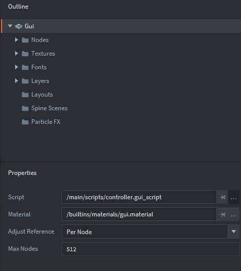
Double-click on the ‘main_menu.gui’ to bring it into focus within the Outline Window — then set the Script within the Properties Window as shown below:
Create an exit_menu.gui_script
To add a new ‘gui_script’ which will be included within our exit_menu.gui perform the following:
Add the gui_script to the exit_menu.gui
Double-click on the ‘exit_menu.gui’ to bring it into focus within the Outline Window — then set the Script within the Properties Window
Create an info_panel.gui_script
To add a new ‘gui_script’ which will be included within our info_panel.gui perform the following:
Add the gui_script to the info_panel.gui
Double-click on the ‘info_panel.gui’ to bring it into focus within the Outline Window — then set the Script within the Properties Window.
Create a level_controls.gui_script
To add a new ‘gui_script’ which will be included within our level_controls.gui perform the following::
Add the gui_script to level_controls.gui
Double-click on the ‘level_controls.gui’ to bring it into focus within the Outline Window — then set the Script within the Properties Window.
VII: FINAL RESULT
Whew ! ~ Hopefully, you’ve been able to follow the overall sequence of build events — as well as the overall logic that is incorporated into this project. At this point our Enhanced Defold Game Template is complete — and I have included the full project within a zipfile which can be downloaded by pressing the following button.

Please let me know if you found this tutorial helpful — any feedback would be greatly appreciated using the following message form.
All the best - Dave
Go to Part 1 Go to Part 2